


Classement


Contenu populaire
Affichage du contenu avec la meilleure réputation le 23/07/2025 dans toutes les zones
-
2 points
-
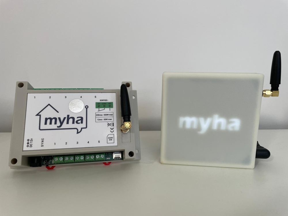
1 pointBonjour à tous et merci pour votre accueil ! Je suis David CAPRON, fondateur de DOMETHIC SYSTEM, une jeune start-up Bretonne ayant mis au point Myha (My Home Automation). Sa particularité ? Fonctionne sans Internet, et peut donc s'installer pratiquement partout. Comment ? La centrale intègre un chatBot par SMS : Vous communiquez avec Myha comme avec ChatGPT. Myha interprète, exécute, et vous répond....même en 2G. Myha se décline en 2 versions : PRO et RADIO. Les 2 versions sont compatibles avec l'écosystème DIO (modules radios distribués par CHACON). La version PRO s'installe dans un tableau électrique et dispose de 5 entrées + 5 sorties filaires, ainsi que la gestion du fil pilote 4 ordres. A votre service si vous souhaitez plus d'infos ! Longue vie à forumdomotique.com ! David
 1 point
 -
 Depuis quelque temps, l'idée d'autoproduire une partie de mon électricité me trottait sérieusement dans la tête. Entre la flambée des prix de l'énergie, la transition écologique et l'envie toute simple d’avoir un peu plus de contrôle sur ma consommation, je me suis enfin lancé. Et je dois dire que ce premier kit solaire plug and play a été une véritable révélation. Car oui, les kits solaires plug and play rendent l’autoconsommation accessible à tous : pas de travaux, pas de démarches complexes et une installation réalisable en moins d’une heure. C’est simple, efficace et motivant. Dans ce contexte, je remercie Materfrance de m’avoir permis de tester leur kit solaire plug and play PowerMax 1040W dans le cadre de cette collaboration, afin de vous proposer un retour complet, concret et indépendant. Le modèle que j’ai installé embarque deux panneaux solaires IzyPower de 520W, leurs fixations au sol en orientation paysage Izysun et un micro-onduleur DEYE 1000W pour convertir le courant continu en courant alternatif. L’ensemble constitue un kit solaire plug and play clé en main, parfaitement adapté à l’autoconsommation résidentielle. Une fois les panneaux installés et le micro-onduleur connecté, il suffit de le brancher sur une prise électrique classique pour commencer à produire et consommer sa propre électricité. Et franchement, c’est le pied. Voir ses propres panneaux produire de l’électricité, même sous un ciel nuageux, procure une vraie satisfaction. On suit la production en temps réel, on observe les pics d’ensoleillement, on commence à décrypter sa propre consommation… C’est concret, gratifiant, presque addictif. Et surtout, ça donne envie d’aller encore plus loin dans l’autonomie énergétique. Je vous embarque donc dans cette aventure, de la réception du kit jusqu’à sa mise en service, en passant par le montage, le suivi via l’appli Solarman Smart et l’intégration à Home Assistant.1 point
 -
https://zatoufly.fr/quel-dongle-smlight-choisir-mes-recommandations/ La vidéo explique également l'usage des SMLIGHT avec ZHA et ZIgbee2MQTT : https://youtu.be/0VPWKK6qSs41 point
-
bonjour Merci pour cette vidéo : je voulais aussi faire un tableau avec les pièces , mais n'ayant pas les connaissances en Yalm je n'ai rien fait. Là je me suis lancé et c'est effectivement ce qui me manquait. Pour terminer le travail j'ai des commandes de volet avec automatisme et je ne vois pas comment ajouter cela dans la carte pièce ? il n'y a pas de classe de capteur correspondant ? est-ce un manque à ce jour qui va être comblé ?1 point
-
Voici des cartes permettant d'afficher l'heure un peu différemment que proposé nativement. Prérequis:Button Card: https://github.com/custom-cards/button-card card-mod 3: https://github.com/thomasloven/lovelace-card-mod Cartes:Vous pouvez bien entendu mettre cette carte dans le cadre de titre en haut de votre tableau de bord. Pour ce faire il suffit de cliquer sur le bouton permettant d'ajouter un titre, et de remplacer le YAML de la carte par celle que je propose. type: custom:button-card layout: icon_name_state2nd entity: sensor.date size: 24px show_icon: false show_name: false show_state: false styles: card: - padding: 0 - padding-top: 26px grid: - grid-template-areas: '''date s''' - grid-template-columns: auto min-content - grid-template-rows: auto min-content custom_fields: date: - align-self: end - justify-self: right - margin-right: 15px - margin-bottom: 9px - font-size: 16px - text-align: right custom_fields: date: |- [[[ let now = new Date(); let month = ["Janvier", "Février", "Mars", "Avril", "Mai", "Juin", "Juillet", "Août", "Septembre", "Octobre", "Novembre", "Décembre"]; return now.getDate() + ' ' + month[now.getMonth()] + ' ' + now.getFullYear(); ]]] card_mod: style: | ha-card { backdrop-filter: none !important; background-color: transparent; box-shadow: none; border: none; } grid_options: columns: 6 rows: 1 type: clock clock_size: medium show_seconds: true grid_options: columns: 6 rows: 1 card_mod: style: .: | ha-card { backdrop-filter: none !important; background: transparent; box-shadow: none; border: none; } ha-card > .time-wrapper.size-medium { height: auto; padding: 0; row-gap: 12px; } ha-card > .time-wrapper.size-medium .time-parts { font-size: 4rem; } ha-card > .time-wrapper.size-medium .time-parts .time-part.am-pm, ha-card > .time-wrapper.size-medium .time-parts .time-part.second { font-size: 24px; margin-left: 8px; } type: horizontal-stack cards: - type: clock clock_size: medium show_seconds: true grid_options: columns: 6 rows: 1 card_mod: style: .: | ha-card { backdrop-filter: none !important; background: transparent; box-shadow: none; border: none; float: right; margin-right: -52px } ha-card > .time-wrapper.size-medium { height: auto; padding: 0; } ha-card > .time-wrapper.size-medium .time-parts { font-size: 4rem; } ha-card > .time-wrapper.size-medium .time-parts .time-part.am-pm, ha-card > .time-wrapper.size-medium .time-parts .time-part.second { font-size: 22px; margin-left: 8px; } - type: custom:button-card layout: icon_name_state2nd entity: sensor.date size: 24px show_icon: false show_name: false show_state: false styles: card: - padding: 0 grid: - grid-template-areas: "'date'" - grid-template-columns: auto - grid-template-rows: auto custom_fields: date: - height: 20px - align-self: end - justify-self: start - margin-left: 20px - margin-right: 15px - margin-top: 22px - font-size: 20px custom_fields: date: |- [[[ let now = new Date(); let month = ["Janvier", "Février", "Mars", "Avril", "Mai", "Juin", "Juillet", "Août", "Septembre", "Octobre", "Novembre", "Décembre"]; return now.getDate() + ' ' + month[now.getMonth()] + ' ' + now.getFullYear(); ]]] card_mod: style: | ha-card { backdrop-filter: none !important; background-color: transparent; box-shadow: none; border: none; } grid_options: columns: full type: vertical-stack cards: - type: clock clock_size: medium show_seconds: true grid_options: columns: 6 rows: 1 card_mod: style: .: | ha-card { backdrop-filter: none !important; background: transparent; box-shadow: none; border: none; } ha-card > .time-wrapper.size-medium { height: auto; padding: 0; row-gap: 12px; } ha-card > .time-wrapper.size-medium .time-parts { font-size: 4rem; } ha-card > .time-wrapper.size-medium .time-parts .time-part.am-pm, ha-card > .time-wrapper.size-medium .time-parts .time-part.second { font-size: 24px; margin-left: 8px; } - type: custom:button-card layout: icon_name_state2nd entity: sensor.date size: 24px show_icon: false show_name: false show_state: false styles: card: - padding: 0 grid: - grid-template-areas: "'date s'" - grid-template-columns: auto min-content - grid-template-rows: auto min-content custom_fields: date: - align-self: end - justify-self: center - margin-right: 15px - margin-bottom: 9px - font-size: 16px custom_fields: date: |- [[[ let now = new Date(); let month = ["Janvier", "Février", "Mars", "Avril", "Mai", "Juin", "Juillet", "Août", "Septembre", "Octobre", "Novembre", "Décembre"]; return now.getDate() + ' ' + month[now.getMonth()] + ' ' + now.getFullYear(); ]]] card_mod: style: | ha-card { backdrop-filter: none !important; background-color: transparent; box-shadow: none; border: none; }


 1 point


Ce classement est défini par rapport à Paris/GMT+02:00